Ever since SharePoint has been used by organizations many years ago, one of the first things they like to customize or change is its look and feel. Whether this is for corporate branding reasons, usability concerns or just out of personal preference, changing the way SharePoint looks has been a hot topic since day one.
“SharePoint 2013 Branding and User Interface Design” Wrox Press book authored by Randy Drisgill, John Ross and Paul Stubbs aims to put a nail in the coffin of branding and UI design confusion that has plagued so many designers and developers with SharePoint. This review is my personal take on the content of the book and the job the authors have done.
Disclaimer: I was provided a copy of the book free of charge by Wrox for the purpose of reviewing it.
With that out of the way let me get to the meat and potatoes of this review …
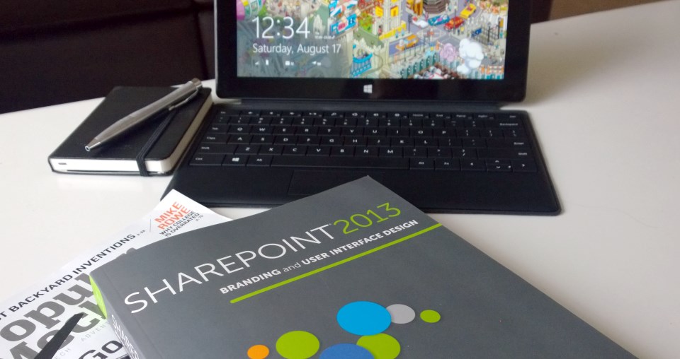
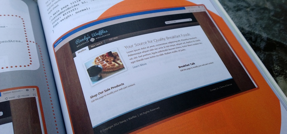
From the moment I opened the package that the book arrived in I knew this was no ordinary technical SharePoint book. Most technical books share the same boring layout, are generally printed in black and white and maybe mistaken for one another if you were picking them out of a pile in a hurry. Not this one. The book is printed in color for a start. Screenshots are not small and grainy and the color really adds a sense of realism to them that I hadn’t realized I was missing until now. The book is organized and arranged in sections much like other books, however colors depict different sections so you know where you are. It makes it easier to flick though and find the bit you are looking for. Overall I was totally blown away by the arrangement, use of color and downright differentness of this book. It really adds something and obviously a lot of effort has been put into thinking this through. I guess I shouldn’t have been so surprised with this being a book on design and UX, but it was the first technical book I have read like this and it really impressed me. Very nice indeed.
But a book isn’t all about its layout.
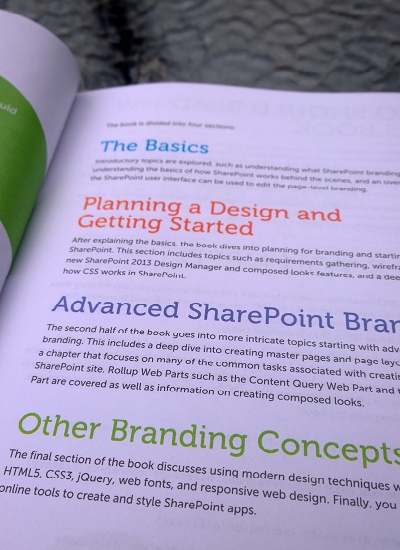
The content is arranged in four main sections:
- The Basics
- Planning a Design and Getting Started
- Advanced SharePoint Branding
- Other Branding Concepts
This book offers something for everyone. The progression from things like the reasoning why you people want to brand SharePoint to the basic concepts in SharePoint branding such as masterpages, page layouts and tools involved is a great place for beginners to start. Readers with some SharePoint background could choose to skip this section, however throughout the book there are useful tidbits and lessons for even the most expert among us. Additionally this section introduces features like composed looks, image renditions and the design manager that are new to 2013 so it may be wise to read it regardless.
In my view section 2 is really where the rubber hits the road. This section called “Planning a Design and Getting Started” is all about how to go from a design concept you have in your head to beginning the implementation of that. When I say going from zero to hero I really mean it. It starts at “Why plan”! It then moves into gathering requirements and Information Architecture. Showing the reader why wireframes are important, how the various visual components of a SharePoint page are structured and how to build up a design comp are covered here too. These beginning steps are so often glossed over in branding and design projects. It’s really great to see this stuff covered in a reasonable level of detail.
The SharePoint landscape changes significantly in 2013 with the introduction of being able to use other common design tools for working with SharePoint designs. In the past it was mostly SharePoint Designer, now designers can use tools like Dreamweaver to get the job done. The new Design Manager features enable this whole slew of new things and Chapter 5 covers this wonderfully. This is all new stuff and the authors clearly articulate the what and how of using it.
Finally this section covers the long hated SharePoint CSS. These are big and hard to navigate and learn, but the team have done a solid job of walking through the main parts of the CSS, visually showing you what styles effect what visual elements and how things effect each other. This is a must understand topic for people new to SharePoint design and it’s a basic but excellent starting spot.
The, Blue, section 3 moves deeper into advanced topics the content of which readers will really need to understand if they are going to actually build production ready solutions. Some of the critical bits I found very important in this section were primarily about creating custom master pages, page layouts and the all-important Content by Query and Content by Search web parts. These are so core to web content management scenarios in SharePoint that there really is no way readers doing projects won’t come across the need for them.

Personally the most valuable section of the book for me was the last, the green one. And in particular chapter 11 on modern web design concepts. This covers topics that are very prominent in the world of web design, and, as of writing, and are being talked about and debated at every conference and in many blog posts. The world of mobile rapidly expanding is pushing the importance of building sites that use modern techniques to deal with devices and screens of all sizes and capabilities.
The authors cover the basics of HTML5/CSS3 fairly lightly, but move pretty quickly onto another very topical technology called JQuery. There is no way anyone reading the book will get a full understanding of these complex technologies from this book. However, they are not supposed to. There are a plethora of books dedicated to these topics and so this book basically just introduces the reader to them and how they relate to SharePoint. In order to get productive with these technologies the reader will need to seek out another book or course.
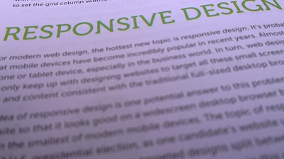
The topic many will be very interested in within this chapter is the part on Responsive Design. This seems to be the most talked about topic on the internet today regardless if it relates to SharePoint or not. Again, although this topic is wide ranging and complex the chapter introduces the reader to the topic well and also shows a solid example of how to apply the techniques to SharePoint. It shows a simple site in full Desktop resolution, medium resolution and then on a narrow resolution that resembles a mobile device.
No SharePoint 2013 book would be complete without touching on the complex and hotly debated topic of SharePoint Apps. This book is no different in that regard and walks the reader through a few of the basics about apps and how they are built. This section is pretty light and isn’t designed to cover all the ins and outs of app development, but it does touch on (lightly) the techniques of branding in apps such as the CSS styles from the host web app and the chrome control. This is a rapidly developing area of SharePoint and, to be honest, I don’t think anyone has yet really mastered app development to an advanced point, so the book focuses on just the bits you need to get going.

Summary
Right from the moment I opened this book I knew it was going to be a well thought out piece of literature. The authors really know their stuff and are regarded as some of the best minds in the SharePoint Branding space. The information is accurate and goes deep enough where needed for the reader to get at least to what I would commonly call an intermediate level of knowledge. The only way people get to expert is by doing projects and really working with the product. The progresses well through introducing foundational concepts in SharePoint, but then also building on them and discussing how they relate.
I really only have one complaint from a content point of view that I was desperately wishing was covered. Application Lifecycle Management and how it relates to SharePoint Branding. With the introduction of the Design Manager no one, from what I have seen, has really nailed guidance on how to best deal with those design manager assets and how to best integrate them into the overall code/asset lifecycle management process. I would have loved to have seen some solid guidance on how best to do this in the book. It’s a big issue currently facing many people and I suspect many readers will be looking for the same.
My only other gripe is that with the new, and welcome, layout of the book comes a lack of numbering. Sections and chapters are numbered, but topics within them are not, and so I just felt myself tyring to navigate around the book a little harder than most. I admit that my style of “reading” a book is not always starting and the first word and finishing at the last, and so others may not be so concerned about this. Maybe it’s just me 🙂
This book in my opinion is a must have feature of any SharePoint developers reference library. Even if you are not explicitly doing the branding or design of a site many of the topics will be relevant to those building web parts or other code. Over the last couple of weeks of having the book on hand I found myself reaching over for it a number of times to see what the authors had to say on a topic. Very useful indeed.
Congrats to Randy, John and Paul for an excellent addition to the SharePoint literary world.
-Chris.
This is one awesome blog post. Keep writing. ekedkkbdaeeb